Brand Identity — Loa & Faye
Building a Brand as Bright as the Kids it Serves
Where care meets play.
Wiggle & Go is a mobile paediatric physiotherapy practice built around the families it works with. The founder came with a clear sense of heart — warm, energetic, genuinely invested in the kids she works with — and needed a brand that matched it.
The brief was to build something that felt as welcoming to a two-year-old as it did to their parents. Playful enough to disarm, considered enough to trust. We worked together to define the audience, shape the visual language, and build a brand from the ground up — mascot and all.
Brand Strategy
Wiggle & Go sits closer to a children's studio than a healthcare practice. The strategy leaned into movement and personality as points of difference — playful without being chaotic, clinical enough to trust, warm enough to remember. A brand that puts kids at ease and gives parents confidence.
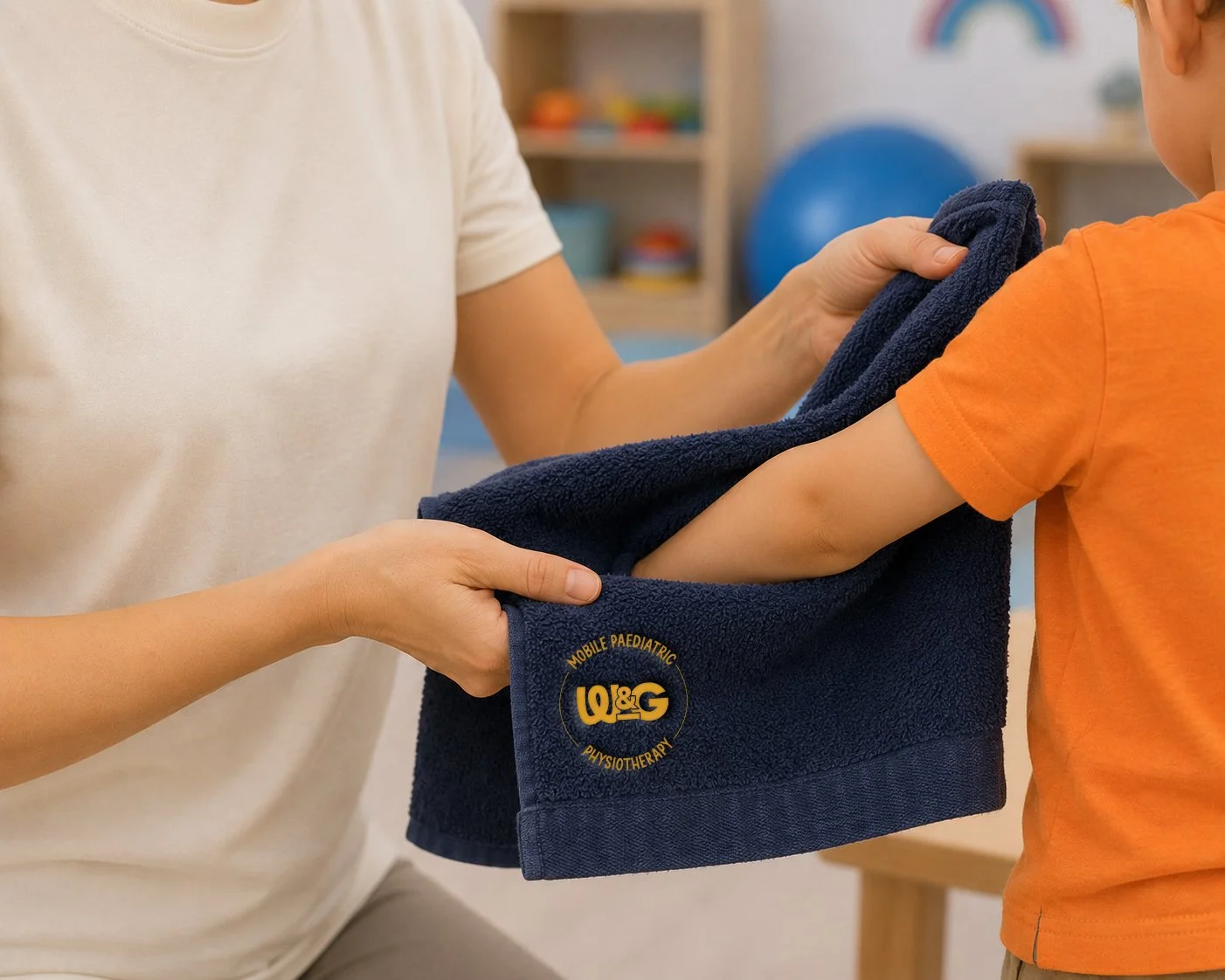
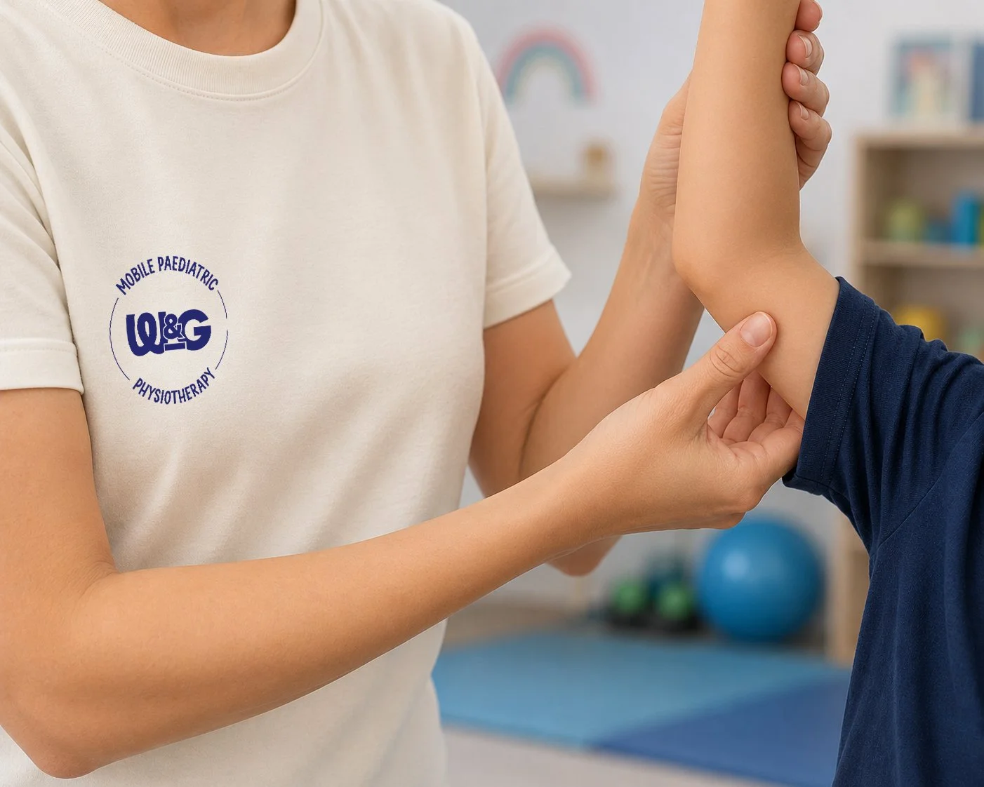
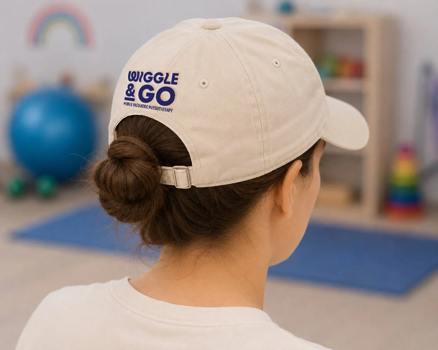
Logo Design
The wordmark takes its cues from simple toy shapes — rounded, friendly, built for small hands and big rooms. Nothing sharp, nothing serious. It sits comfortably on a referral card or a clinic wall without losing an ounce of personality.
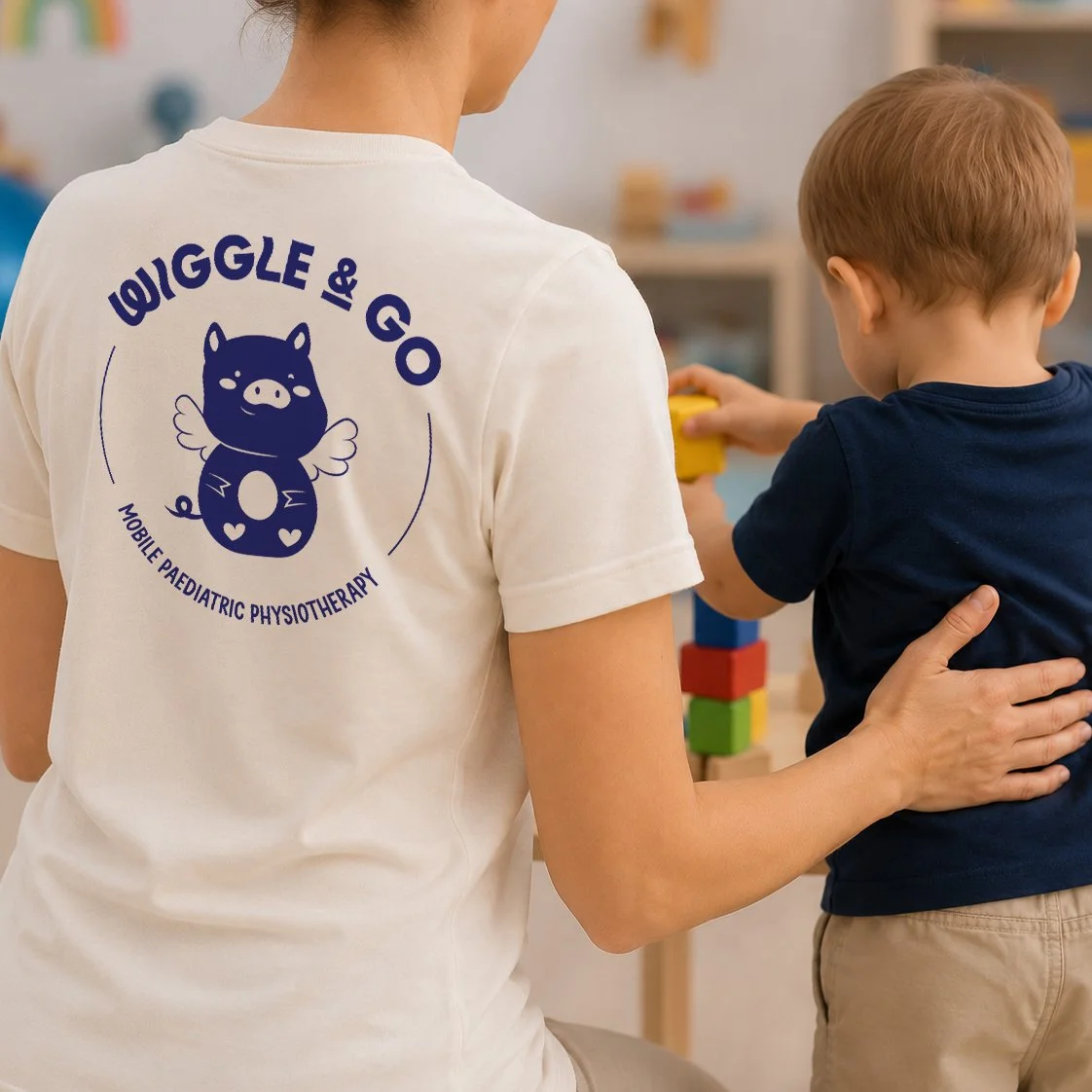
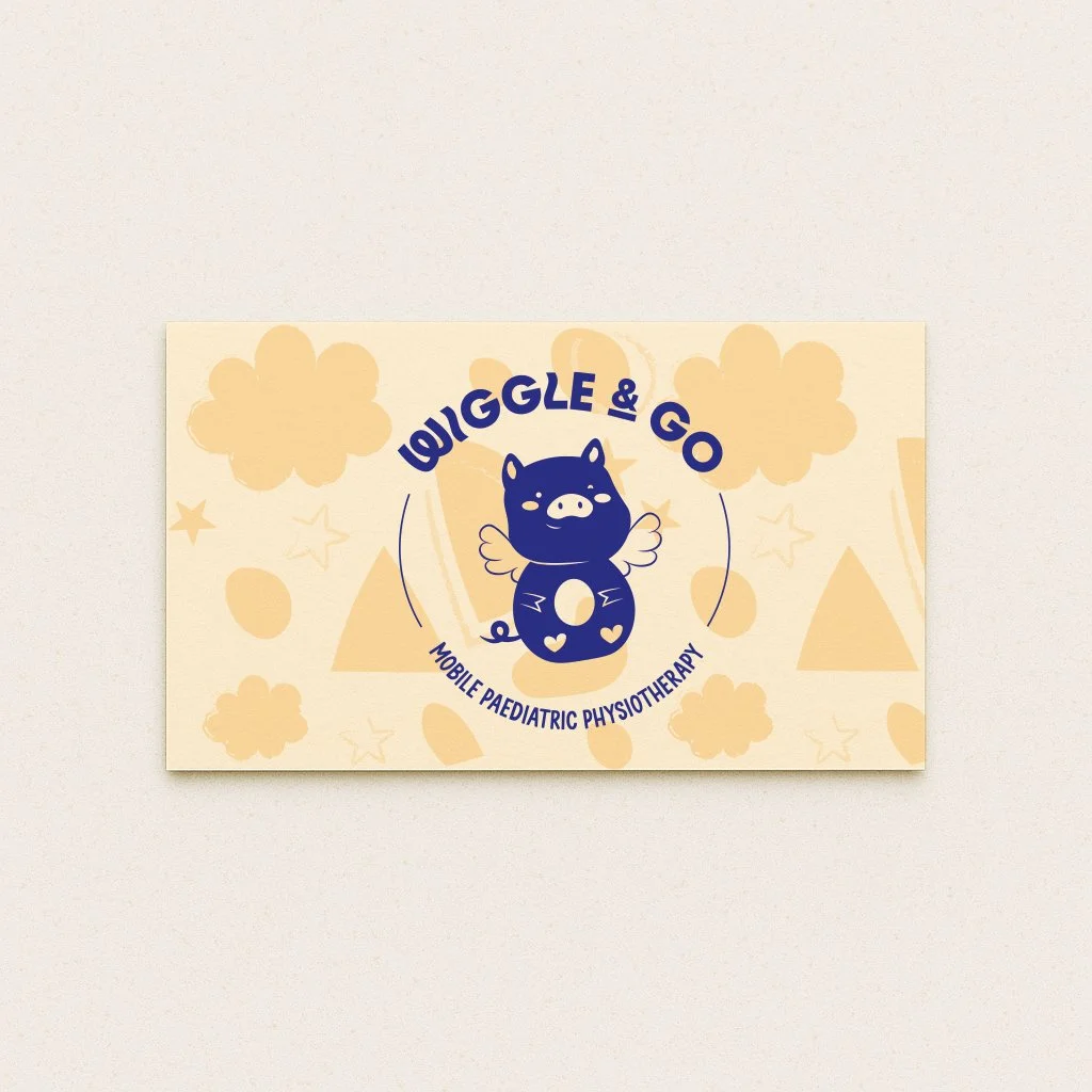
Mascot Design
Scoot the Pig started as a personal reference and became the heart of the brand. A character that celebrates movement, curiosity, and care — approachable enough for kids, considered enough for everything else. Scoot does what a logo can't: he makes the brand feel alive.
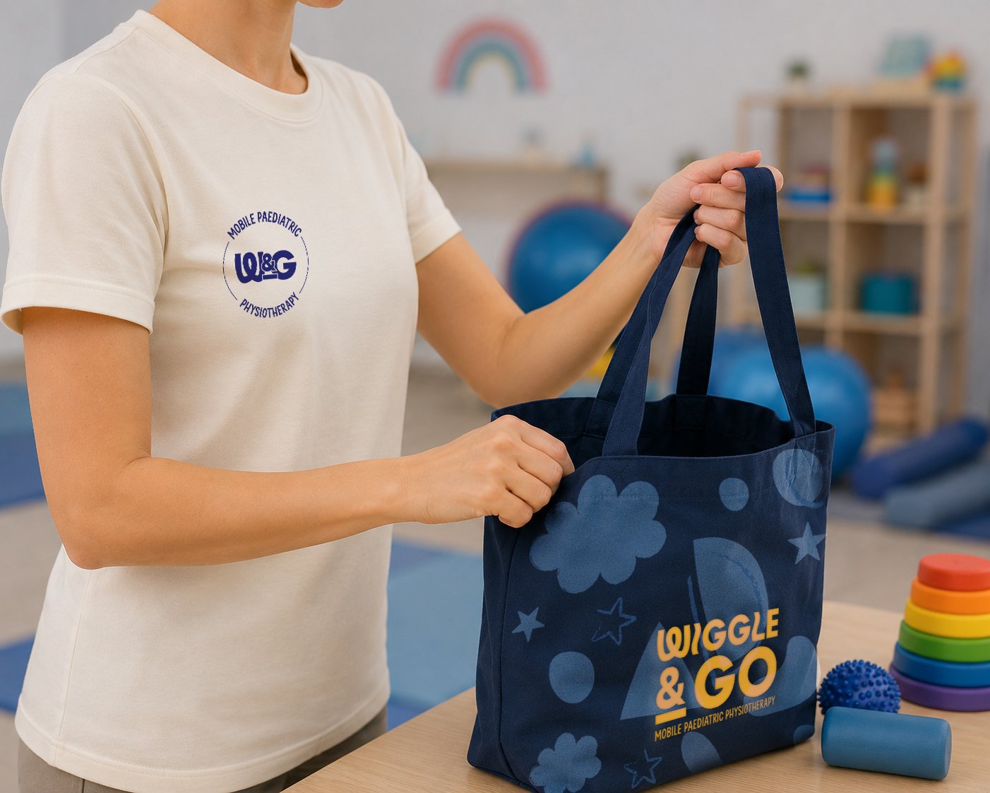
Identity Design
A playful palette, toy-inspired shapes, and a wordmark that moves through every touchpoint without overexplaining itself. The system is flexible enough to grow with the practice — energetic where it needs to be, calm where it counts.