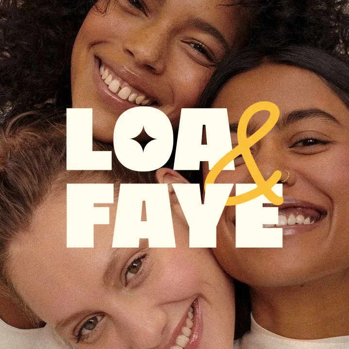
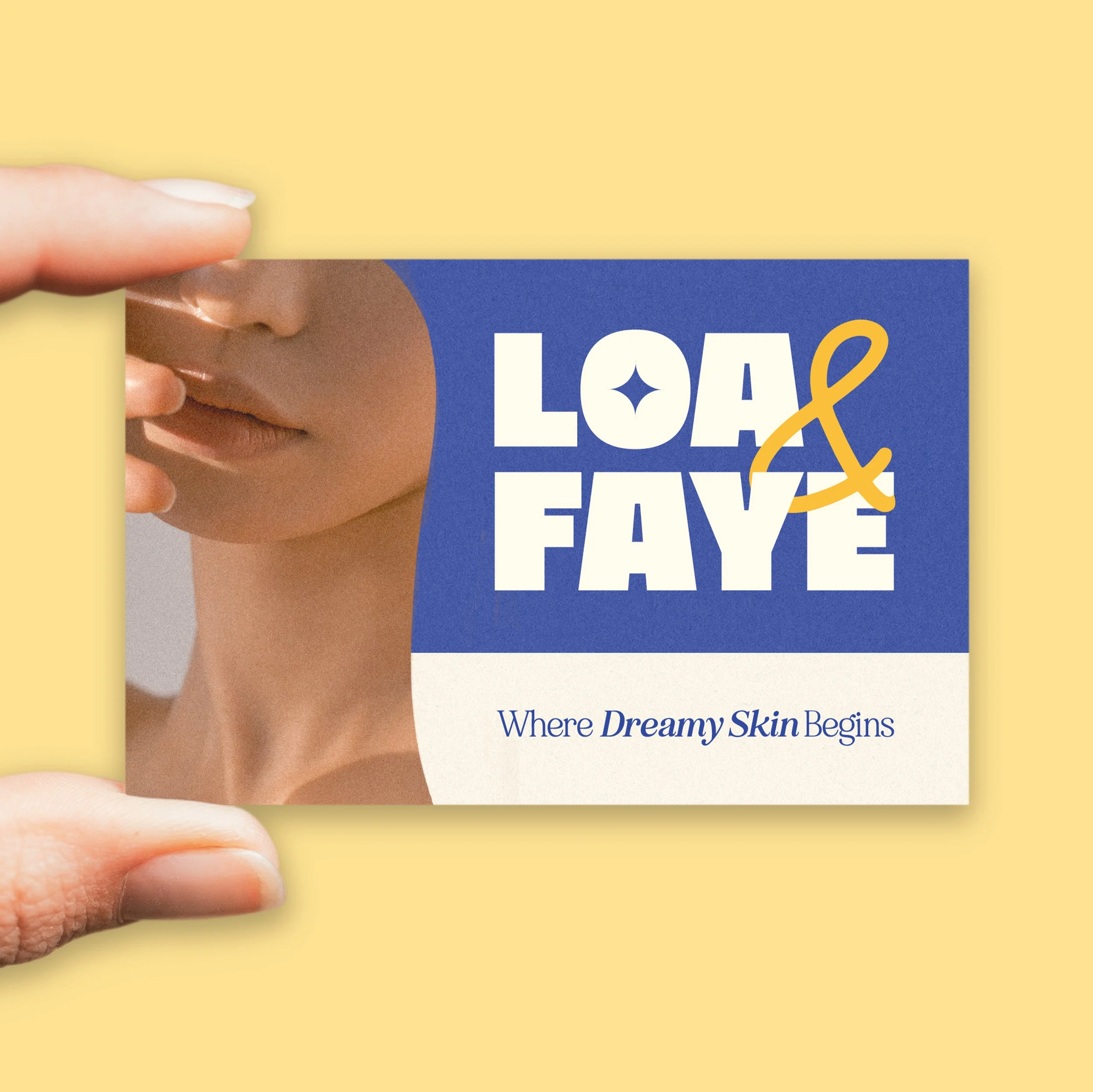
Brand Identity — Loa & Faye
Loa & Faye is skincare that feels like a moment — calm, considered, and quietly confident.
Dreamy, but never vague.
The identity was built around that feeling. A bold slab serif anchors the logo with presence, softened by a handwritten script that keeps it human. Serif headings carry the editorial weight; a clean sans serif handles the rest.
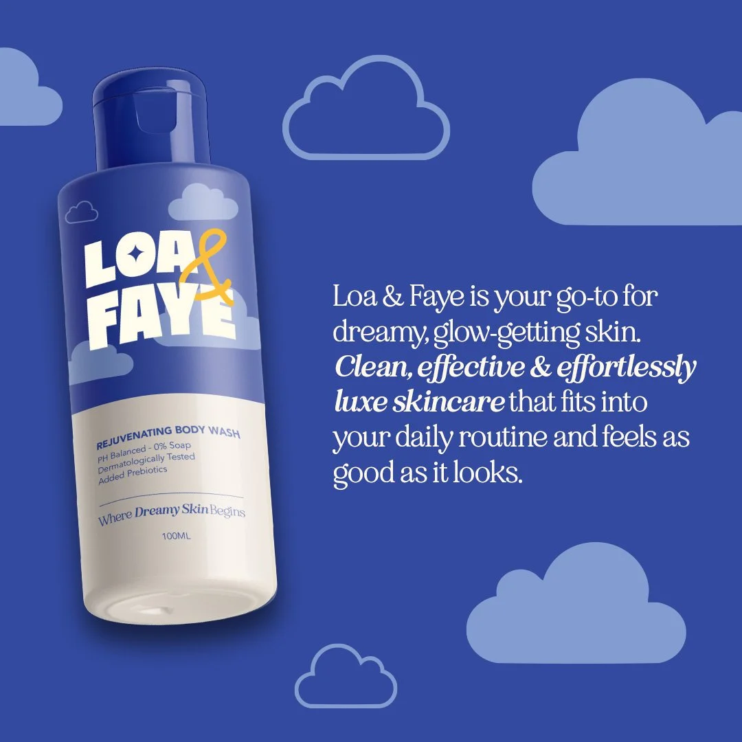
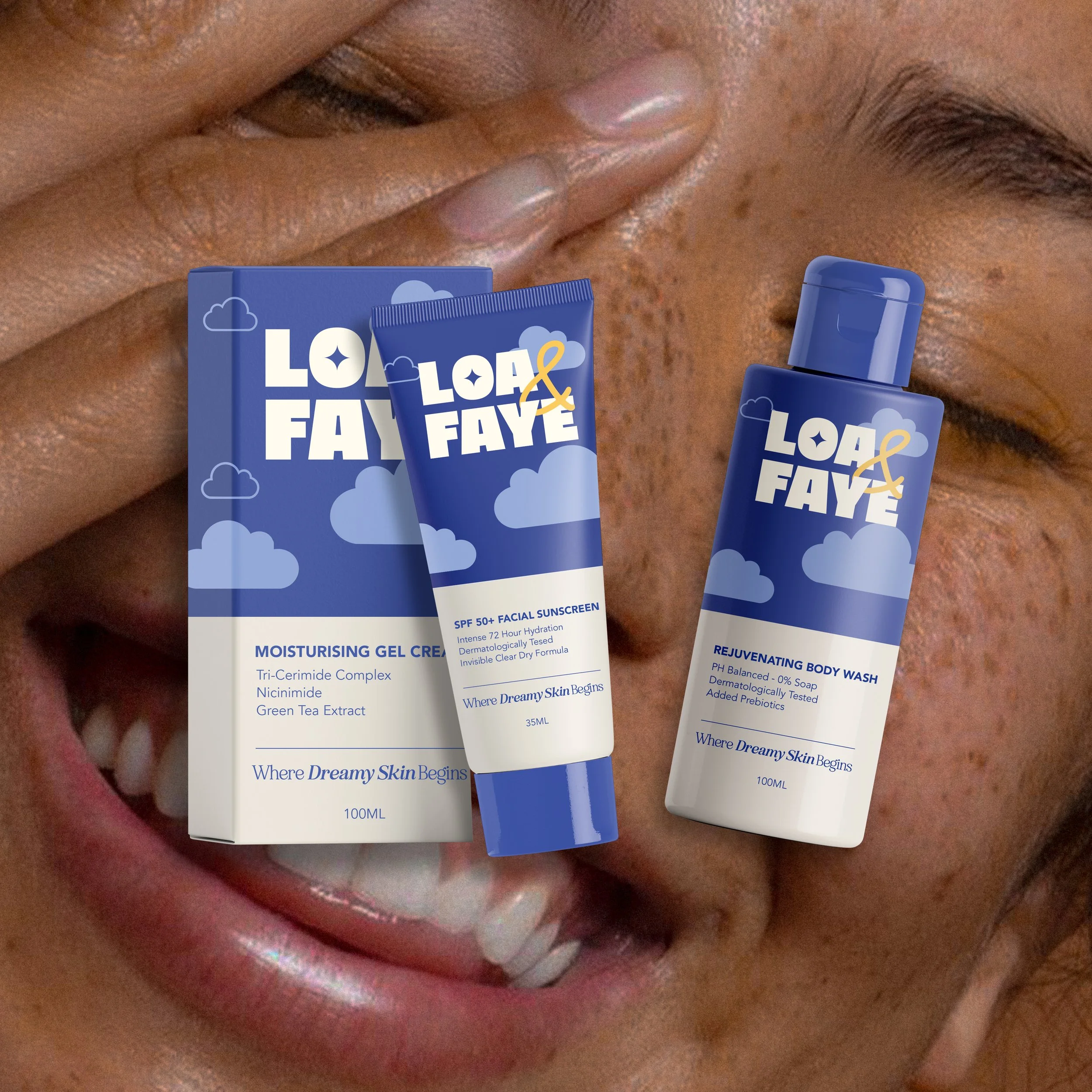
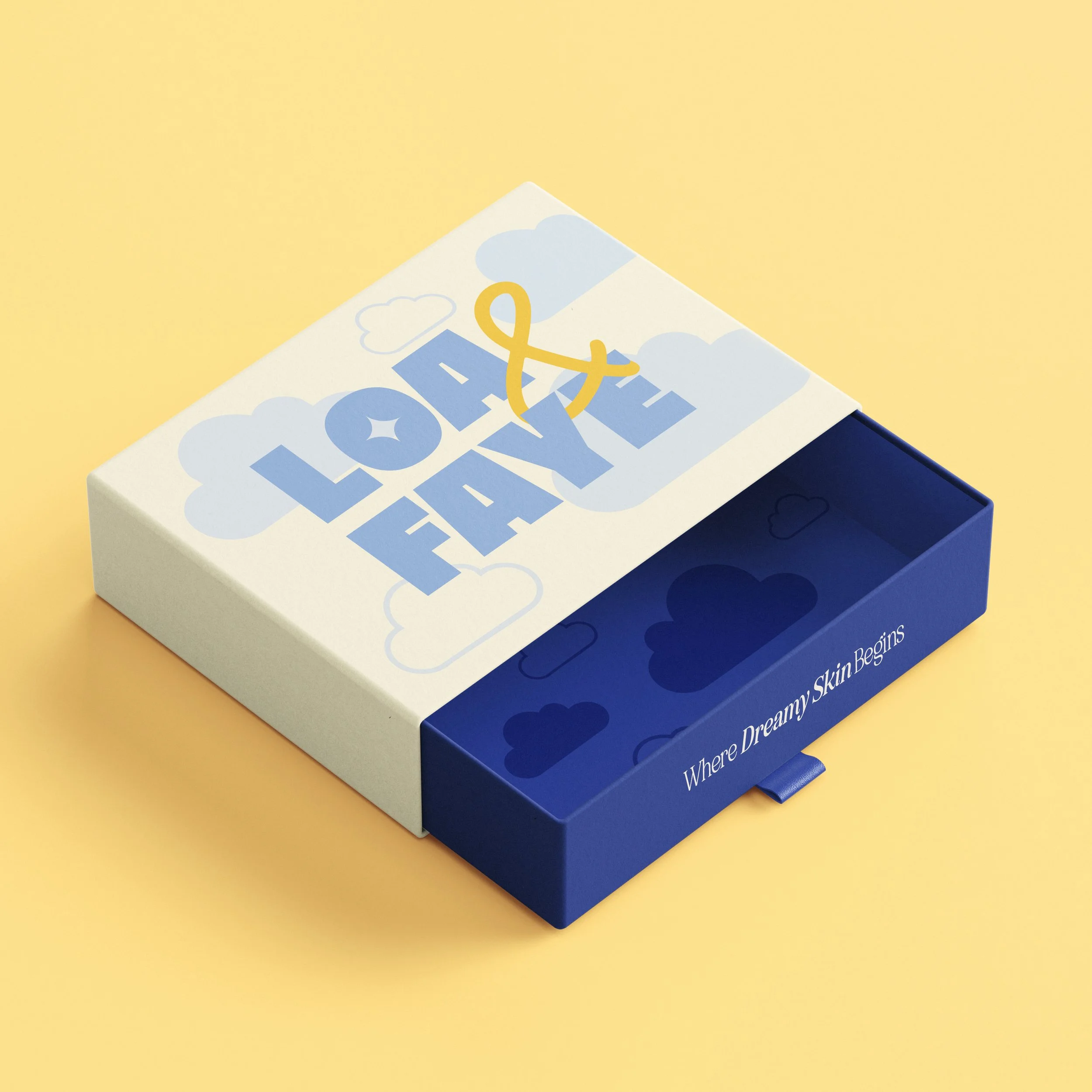
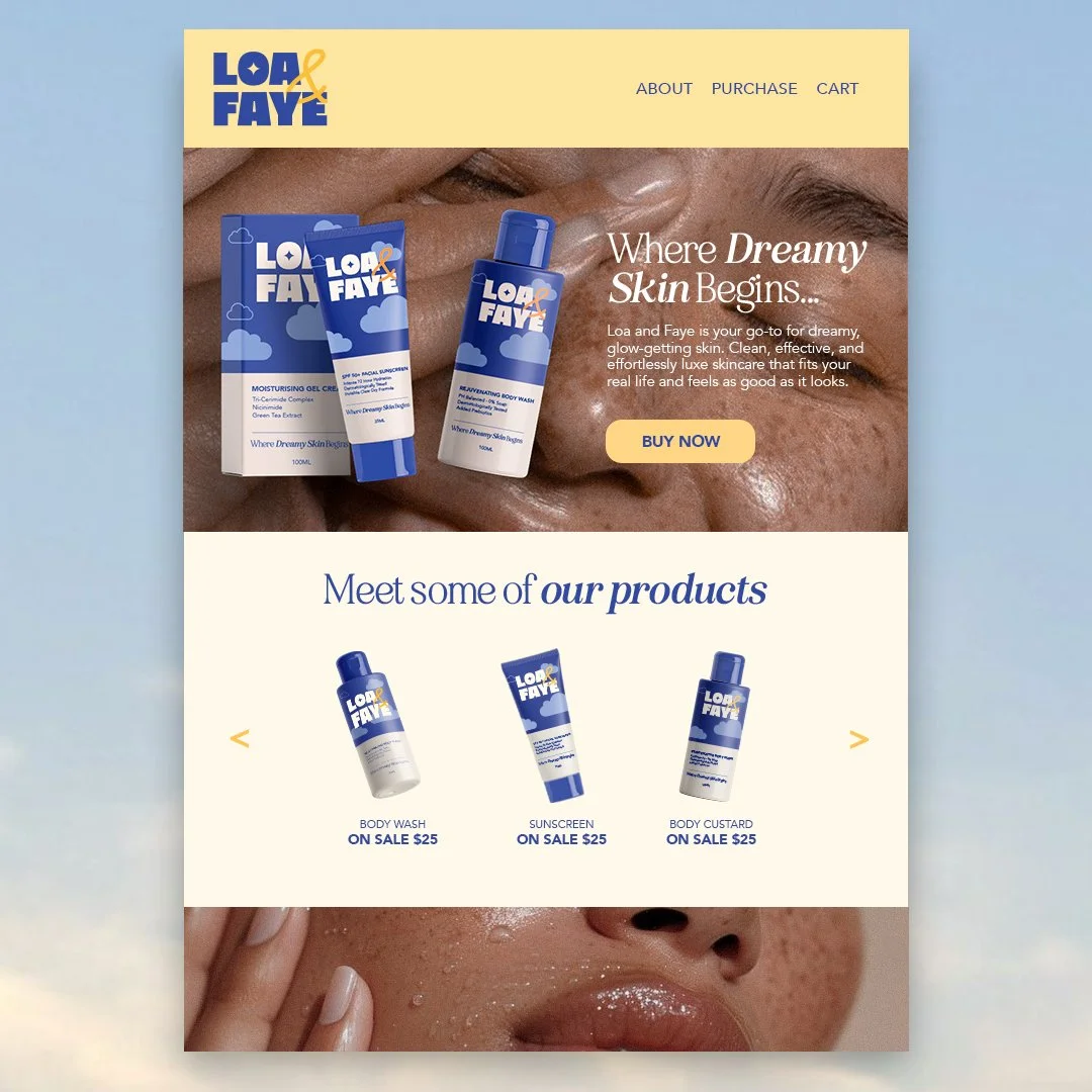
The palette stays close to calm — soft blues as the foundation, a warm orange accent that adds just enough edge. A cloud-inspired pattern runs through packaging and touchpoints, light enough to feel like texture rather than decoration.
The result is a brand system that holds together across packaging, digital, and social — flexible enough to grow, considered enough to last.
Brand Strategy
Loa & Faye sits closer to a wellness ritual than a skincare brand. The strategy leaned into calm as a point of difference — dreamy but grounded, soft without being precious. A brand that feels like it was made for the moment you actually stop.
Logo Design
The Loa & Faye logo doesn't try to look like skincare. The pairing of a bold slab serif with a handwritten script was deliberate — structure and softness held in the same mark. Grounded enough to sit on packaging. Warm enough to feel made by hand.
Packaging Design
A bold colour palette, a cloud pattern that never crowds the space. Uncoated stock that feels considered before anything is even opened. The kind of packaging that earns its place on a shelf — and makes the unboxing feel like part of the product.
Identity Design
The cloud motif carries the same logic as the logo — soft, drifting, never quite contained. It echoes the dreamscape concept without stating it, and moves naturally across every surface it touches. Every element of the identity follows the same instinct: nothing overworked, nothing accidental.