Brand Identity — Hummey Honey
A fresh take on native honey, inspired by the landscapes it comes from.
Honey, rooted in nature.
Hummey’s identity was created to introduce a native floral honey range through a more modern, considered lens. Rather than leaning into the traditional rustic language often associated with honey, the branding takes a cleaner and more contemporary approach.
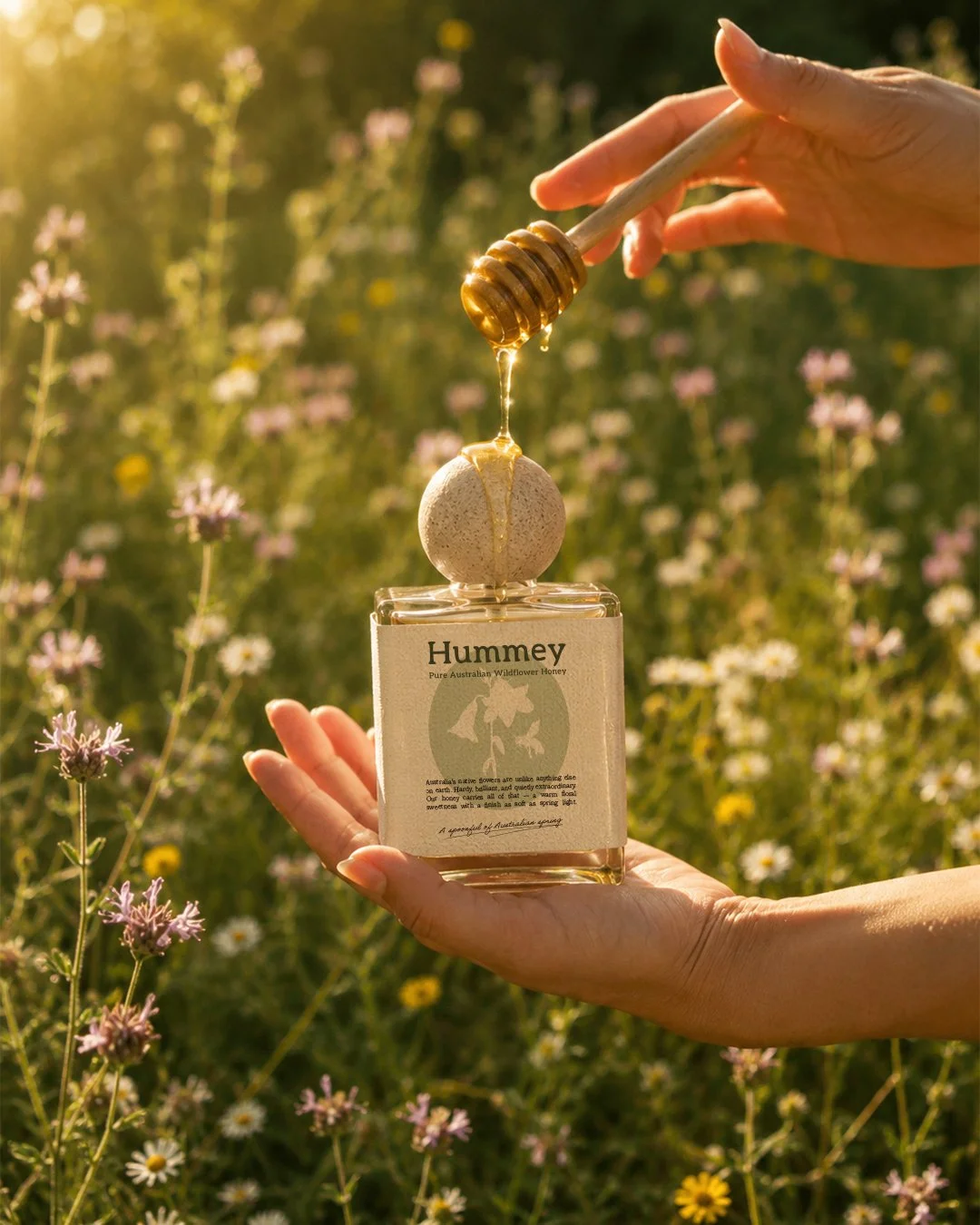
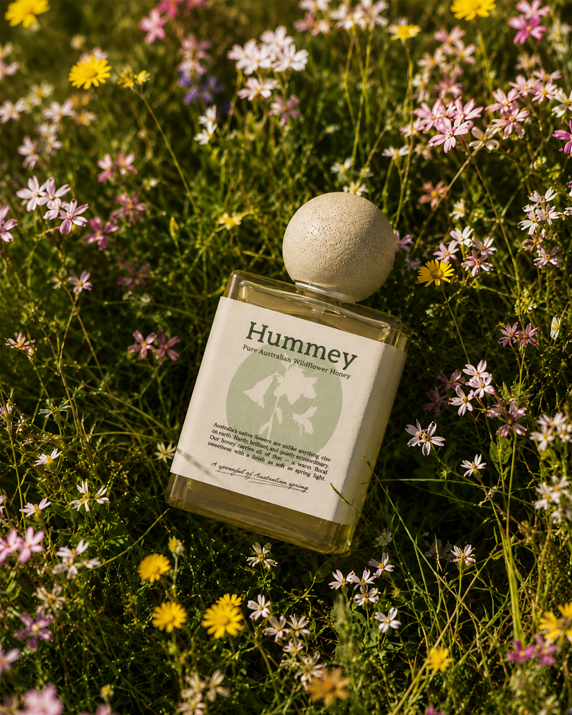
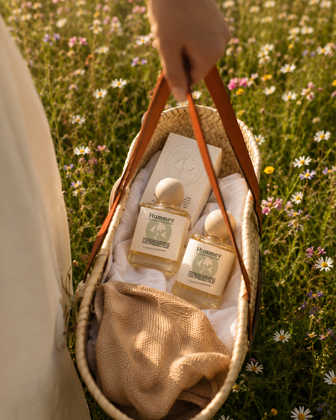
Inspired by Australian native florals, natural textures and the surrounding landscape, the visual identity is simple, fresh and understated. The system allows the product and its origins to remain the focus while still creating a distinctive presence on shelf.
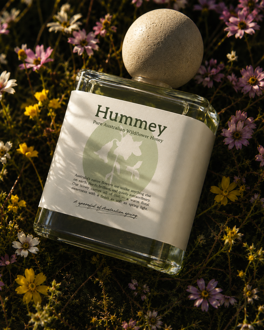
The packaging extends this connection to nature through a stone-inspired lid, bringing a more tactile and unexpected element to the jar. Together, the identity feels grounded in the landscape while remaining refined and modern.
Brand Strategy
Positioning Hummey as a contemporary native honey brand with a strong connection to nature, provenance and everyday ritual.
Logo Design
A simple, modern identity designed to feel fresh, natural and flexible across the wider product range.
Mascot Design
Clean, considered packaging inspired by native flora and the landscape, finished with a stone-like lid that adds texture and character.
Identity Design
A restrained visual language built around natural references, simplicity and modern form — distinctly Australian without feeling overly rustic.